Tag Archives: Global Warming

CNBC stands for Could Not Be Correct?

… or Climate Noobs Bork Climate-science?

… or Can’t News Be Correct?

(add your own below)

The thing is, CNBC, which is supposed to be a news station, is fueling public misunderstanding of climate science. This is bad journalism, and virtually criminal given the importance of climate change and the need for good science based policy related to climate change. We are long past the point where we can tolerate false balance, astro-turfing, and rating mongering. We need to have a good public understanding of climate science, we need it now, and we need “news” organizations like CNBC to stop doing what they are doing.

CNBC has Joe Kernand, who according to Media Matters

was the most vocal CNBC figure on climate change in 2013, frequently pointing to cold weather to suggest that global warming is not occurring. Kernen has long pushed climate science misinformation. In a 2007 segment, he cited the “The Great Global Warming Swindle,” a movie that promoted discredited claims, to criticize singer Sheryl Crow and “An Inconvenient Truth” producer Laurie David for speaking to college students about climate change. In 2011, Kernen co-authored a book titled Your Teacher Said What?!: Trying To Raise a Fifth Grade Capitalist in Obama’s America that compared climate scientists to “high priests” whose work should not be trusted

CNBC has Larry Kudlow, of The Kudlow Report, who

… campaigned against cap-and-trade in 2009, by denying climate change (“a lot of scientists are now saying … this whole thing is just kind of a scam analysis”) and citing The Heritage Foundation’s exaggerated cost estimates for the proposed cap-and-trade program.

CNBC has Rick Santelli who

…is a regular CNBC contributor who some claim fomented the Tea Party movement with a well-publicized rant against government assistance for homeowners struggling to pay their mortgages. Santelli denies climate change, including saying in 2013, “when it comes to macroeconomics or climate change, I think trying to say that the scientific method is alive and well is a real stretch.”

Meanwhile, from Forecast the Facts:

Climate change is “just kind of a scam analysis” by “high priests,” according to the cable business channel CNBC. The majority of its coverage of climate change casts doubt on the science behind it, a Media Matters analysis found.

Several CNBC figures, including host Larry Kudlow, co-anchor Joe Kernen, and contributors Rick Santelli and Dennis Gartman deny manmade climate change — even arguing with their guests from the business world who talk about the risks climate change pose to the economy.

The only scientist that CNBC hosted on climate change in the first half of 2013 was William Happer, a physicist who has not published any peer-reviewed climate research, and who is the chairman of the fossil-funded George C. Marshall Institute.

Forecast the Facts has a petition you can sign, which reads:

Tell CNBC Chief Executive Officer and President Mark Hoffman:

Tell your on-air personalities to stop promoting global warming denial and start reporting the facts on the economic risks of fossil-fueled climate change.

CLICK HERE TO SIGN THE PETITION

How high can the sea level rise if all the glacial ice melted?

NOTE: I’ve rewritten this post and redone the graphic. The original map on which I based the reconstruction, provided by the USGS, is distinctly different than the one the USGS provides today. The difference is, in fact, rather dramatic. In comparing the older and newer versions of the maps, I have decided to assume the later, more recent, version is more correct. I admit to being a little annoyed at the USGS providing a truly bogus map on their web site, but that is water under the bridge, as it were. So, the following post is edited a bit and a new graphic is provided. Thanks to wehappyfew for pointing out the likely error on the map.

There have been times in the past when there was very little ice trapped in glaciers. During this time, sea levels were higher because that water was in the ocean (most of it, anyway). It has been a long time since then. However, with global warming, more and more glacial ice is returning to the sea and this contributes to sea level rise.

The amount of fossil carbon that needs to be released into the atmosphere to cause most of the glacial ice to melt is not known. We can’t directly use ancient time periods to assess modern sea level rise by measuring the sea levels from those periods because there has been too much other stuff going on in ocean basins and along current coast lines. But, we can estimate that there was very little glacial ice during, for example, the early Eocene, and the transition of Carbon in the atmosphere to the formation of glaciers might be under 800 ppm. So, if we double the current amount of CO2 in the atmosphere, maybe that would melt all the glaciers. There was more methane in the air at that time as well, but we are releasing plenty of methane as we also release Carbon, so that’s not much of a problem. The biggest factor is probably this: The configuration of continents have changed since that time to increase the likelihood of glacial formation at the poles, so returning to some Eocene (or other) atmospheric CO2 value may result in much less melting. But that’s OK, because we can certainly increase the amount of carbon to more than around 800 ppm!

If we release CO2 at approximately modern rates (baed on population size), and have population increase up to a point, thus increasing CO2 release (in other words, do nothing significant to mitigate Carbon release, increase the number of people actively releasing it, and population goes up towards 8 or so billion) we can reach over 1000 ppm by 2300 AD, or sooner. That’s surely enough to melt most of the glaciers except bits and pieces in the coldest regions of Antarctica.

It is estimated (see this web page.) that there is about 80 meters of ocean trapped in glacial ice. There are plenty of web sites out there that allow you to add ocean height to see how coastal regions would change, but the ones I know about don’t go to 80 meters. So, to find out what North America would look like, I found a map that has pixels to indicate altitude, with different colors representing topography, at a fine enough level to work with.

The USGS has a map with color coded topography. There is a color break at 60 meters, which is much less than the maximum possible sea level rise. The next break is at 114 meters. That is higher than sea levels will rise. However, if sea level rises to about 80 meters, it will do so unevenly (it may, for example, be much higher in the Carolinas). Then, as sea level rises, the land will be pushed down various amounts by the weight of the water, so 80 meters might be considered a minimum estimate of rise in some areas. Even more important, I suspect, erosion would cause important changes. If you look at, say, a 60 meter topo line in a region made of something other than hard rock, you have to assume that transgression of the sea including the effects of erosion would move way inland in some cases, beyond that topo line.

So, since we are at present looking for an 80 meter contour line easily located on the right scale map, and we only have 60 and 114, but the real contour line we are probably looking for is higher than 80, we could round UP to 114. But that would almost certainly depict inundation of areas that won’t actually be inundated. So, what I’ve decided to do is to put the ocean at 60 meters, then make a grey area (to reflect, well, this being a grey area!) between 60 meters and 114 meters. With ALL of the ice melted, the shoreline will likely be somewhere in this grey area, probably covering all of it (and more?) along the south coast and probably much less in Maine. Either way, Florida is toast. Wet soggy toast.

Also, I decided to focus in on this map a bit and depict the US east of the Rockies. At this scale, the west coast is fairly uninteresting using this method (the continental margin is right at the coast, so it is very steep). And, the transgression effect, the sea moving laterally across the land after a rise, is probably very locally variable and unpredictable there anyway.

One of the interesting things I discovered is that when defining the zone between 60 and 114 meters, that turns out to be a fairly narrow strip along much of the coast. This is what one would expect if somewhere in that zone is the original high strandline from the last time sea levels were that high (a few million years ago or so). So that’s cool.

This is a VERY ROUGH approximation. Just for fun.

Is Global Warming Causing More and Bigger Fires in Colorado?

High temperatures and dry conditions have caused the outbreak, increased intensity, and rapid spread of numerous wildfires in Colorado. Again. Fires happen, but the number, size, and intensity of wildfires in the western United States has been very high in recent years, and this is caused by global warming.

Global warming causes more rain and more frequent and more severe storm lines. More rain causes more plant growth in otherwise arid regions, and severe storms knock a lot of that vegetation down. This causes more light to get to the ground, so “ladder” vegetation, which enhances fire spread, increases, and the fallen branches add to the fuel that has already been increased by the increased rainfall.

Global warming causes drought, when it isn’t busy causing rain. So, areas with increased amounts of fuel that has been configured to increase fire intensity and spreadability become tinder-rich. Along with the drought comes increased spring and summer temperatures, also caused by global warming and this dries out the vegetation making it much more likely for fires to start, grow quickly, spread, and become large.

We’ve known this for some time, and there is all sorts of evidence to back up the assertion that global warming is the reason for the fire seasons on steroids effect we are seeing now (links to some of this are provided below).

So, yes.

James West has written a very thorough piece demonstrating all these connections, and more, in Mother Jones: How Climate Change Makes Wildfires Worse.

And here’s some backup information for you:

<li><a href="http://www.sciencedaily.com/releases/2006/07/060710084004.htm">More Large Forest Fires Linked To Climate Change</a></li>

<li><a href="http://www.nature.com/nature/journal/v470/n7334/full/nature09763.html">Human contribution to more-intense precipitation extremes</a></li>


<li><a href="http://www.guardian.co.uk/world/2013/jun/04/climate-change-america-wildfire-season?CMP=twt_gu">Climate change causing US wildfire season to last longer, Congress told</a></li>

<li><a href="http://www.esajournals.org/doi/abs/10.1890/ES11-00345.1">Climate change and disruptions to global fire activity</a></li>

<li><a href="http://onlinelibrary.wiley.com/doi/10.1029/2012GL051000/abstract">Evidence linking Arctic amplification to extreme weather in mid-latitudes</a></li>


<li><a href="https://www2.ucar.edu/atmosnews/news/1036/record-high-temperatures-far-outpace-record-lows-across-us">RECORD HIGH TEMPERATURES FAR OUTPACE RECORD LOWS ACROSS U.S.</a></li>

<li><a href="http://www.nrcresearchpress.com/doi/abs/10.1139/x09-153#.Ubnq5fb7289">Potential changes in monthly fire risk in the eastern Canadian boreal forest under future climate change</a></li>

More on Climate Change here.

Photo Credit: jonathanpercy via Compfight cc

The Ice Cap is Melting and You Can Help

Obviously, you don’t want to help melt the ice cap. But you can help scientists figure out how and why it is happening and to learn important details of what might be one of the most important effects of global warming happening right now.

First, a word on why this is important. Look out the window. If you live in Bavaria, and you look out your window, perhaps you can see fish swimming by because you are in the middle of a huge flood affecting Central Europe. Look out the window. If you live in the American Midwest, it is either raining, about to rain, or it just rained, and you might be experiencing unprecedented flooding. Good luck getting your corn crop in. Actually, it is too late for corn, maybe try the soybeans in a week or two.

Look out the window. If you live in Colorado, you might not see much through the smoke from a nearby wildfire. Look out the window. If you live in the American Southwest or southern California and you have a thermometer outside, maybe it just broke because it was not designed to measure the very high temperatures you are experiencing.

Climate change is causing what meteorologists have been calling “Weather Whiplash” also known as “Weather Weirding.” This includes extreme heat, extreme cold, snow when it is not supposed to snow, way more rain than normally happens, and so on. There are multiple climate change related causes for some of this weather but much of what we are experiencing has to do with a fundamental shift in how the Northern Hemisphere’s temperate weather patterns operate. Normally temperate regions are separated from cooler regions to the north by a jet stream that runs in somewhat wavy line around the entire globe. This division between temperate and sub-arctic air masses exists because of the gradient in temperature from south (warmer) to north (cooler). This is a well understood phenomenon. However, over the last decade, the Arctic region has warmed considerably. This warming initially caused the ice that should cover much of the Arctic Sea, even in the summer, to melt off far more than it ever has during the warm season, which exposes water. Glare ice reflects sunlight back into space, but water absorbs it. Even the wet meltwater on the surface of the Greenland Ice sheet absorbs heat rather than reflects it, as it would were it frozen. So, warming has caused more warming in a seemingly unstoppable positive feedback system. This has gotten worse year after year.

This Arctic warming has proceeded at a pace faster than science. Research cycles take a few years. First, scientists concieve of an idea, get a bit of preliminary funding, then do a preliminary project or two. This refines and verifies their ideas and they seek more funding. Then they begin a longer research project that produces a series of conference papers, the occasional publication, etc. The ideas continue to be refined and adjusted, the bad parts being discarded, the verified parts being built on. Somewhere along the line ginormous computer models are brought into play to develop a more complete understanding of the thing being investigated. These computer models may require time on hard to access ginormous computers. More publications come out. Eventually there is a pretty good widely accepted model for some natural process related to climate change, but that took five years or so. The Arctic warming has proceeded at a pace faster than this model of science can keep up with.

But I digress, slightly. Let’s get back to the jet stream.

Arctic warming has decreased the intensity of the south (warmer) to north (cooler) temperature gradient in the Northern Hemisphere. This has caused the jet stream to change. It has become wiggly-wobbly instead of straightish. The jet stream now has big curves in it, and these curves under certain not-very-uncommon conditions tend to get stuck in place. So, the high winds of the jet stream are still streaming along but the curves themselves tend to move very little or just stay in place. At the turning points of the curvy jet stream form ginormous vortexes of air which promote storm formation. So, we have storminess, and we have storminess stuck in one region of the globe for a long time. This has caused the flooding we’ve seen. Also, the jet stream is less effective as a barrier between the warmer and cooler air masses. So, for example, even while some regions have been experiencing excessive heat, areas that normally would be warming nicely for the spring stayed cool this year. This coolness, strangely, is caused by heat. April, for instance, was very cool in the Upper Midwest of the United States, but to the north it was warmer than it should have been. The total average temperature was increased, but the barrier between colder-cool and warmish-warm broke down, so we had coolish warm in the south and warmish cool in the north. Putting this a different way, if the Arctic is the freezer compartment of your fridge, and Minnesota is the refrigerator, it is like someone cut a hole in the barrier between the freezer and refrigerator compartments. Your ice is wet and melting and your milk has a skim of ice on it.

This is what we think is happening, but as I noted above, the speed with which science can understand major complex systems like the earth’s climate is measured in chunks of years, while the current change is happening very very quickly. This is one of those situations where, if this was a movie, the President of the United States would tell the White House Science Advisor to assemble a team. In the next scene there would be a team of scientists being lowered from a helicopter onto the Greenland Ice Sheet in order to collect critically important data. In the next scene, in the White House Situation Room, the scientists would be delivering the bad news the the President and various assemble high level officials.

“It’s bad, Mr. President,” the crackling voice of the scientist over a barely adequate short wave connection intones.

“Just give it to me straight, no need for sugarcoating,” comes the presidential voice of Sam Waterston, or perhaps Luke Wilson, playing the role of President.

“Well, Mr. ..esident. It’s all …et here.”

“Come again? You’re breaking up.

“Wet. It’s all ….et …ere. The …eenalnd ice …ap. …elting faster than we … …aster than we …ought..”

“Can’t we have a better connection?” yells the frustrated President.

“Aaaaaaaarg…..” The last words from the science team. But don’t worry, they’ll make it back in time for the chief scientist’s teenager’s graduation party but that will involve falling though several holes in the ice and enlisting the aid of a band of Inuit hunters.

The thing is, in real life, it does not work that way, and we are behind in understanding what is happening in the Arctic. One of the most important things happening up there is the melting of the surface of the Greenland glaciers, which, in turn, might be caused by a newly discovered phenomenon known as Dark Snow.

With climate change we have more dust from drought-stricken regions and lots of soot from widespread wildfires. This stuff settles on the otherwise highly reflective snow and ice of the Greenland glacier and causes the conversion of sunlight, which would otherwise reflect away into space, into heat, and that heat melts the ice and snow, turning it into liquid water. Liquid water then continues to absorb more sunlight, converting it into heat. This causes more Arctic warming which may contribute to more dust and soot, and so on and so forth in a vicious positive feedback cycle. And by “positive” we do not mean “positive in a good way.”

John Abraham, a climate scientist at St. Thomas University, has just put up a blog post that provides an excellent overview of the problem in Greenland and the Dark Snow Project, which is a crowd funded project designed to understand what is happening there, being run by scientist Jason Box:

… Box has assembled a team of scientists and communicators to collect and analyze samples from key locations on the ice sheet, and report those results directly to the public. The plan is to arrive in Greenland in late June, just as the peak melting season and fire season coincide. Box will be joined by Bill McKibben, who will be covering the research for Rolling Stone, and videographer Peter Sinclair, whose series of climate change videos on YouTube has gained high praise from climate scientists.

Here is John Abrahamn’s blog post: Why Greenland’s darkening ice has become a hot topic in climate science: Darkening causes the snow to absorb more sunlight which in turn increases melting

I strongly urge you to click through to John’s post, read about Greenland and Dark Snow, then click through the link he provides to the Dark Snow project and give them five dollars!!!

What are you doing staring at this blog post. CLICK HERE NAO!!!

Weatherman Bob and the Green Screen

Weatherman Bob disappeared today. He was consumed, or maybe absorbed, by his Green Screen. A Green Screen is a screen, green in color, with special properties. A TV studio camera and the equipment it is hooked to replace the green screen with an imaginary background. So, a person who is not green can stand in front of the Green Screen and to the TV viewer it will look like the person is standing in front of something else. This is how weather reporters on TV ply their trade. They look like they are standing in front of a map of the region showing cold fronts and warm fronts and temperatures and pictures of a kitten buried in snow or a Minnesotan scooping up golf ball size hail while wearing shorts and a furry hat. And today, Weatherman Bob’s Green Screen consumed or absorbed him. It was pretty funny.

I first saw Bob about a dozen years ago when I moved to a new town. There were two weather reporters who seemed to be able to predict the weather reasonably well, on two different stations. One of them was Bob, the other one was Doug. Both of these are made up names. I remember the first time I looked at the weather in this town. I had been out driving and was caught in a severe thunderstorm, on the highway. After I got through that I was driving into town and I saw a giant spinning cloud in the sky. It was just like a tornado but horizontal and at high up. I thought, “Wow, the people in this town don’t know how lucky they are. Where I come from it is not every day you get to see something like that!”

Later I got home and turned on the TV and there was Doug the Weatherman showing a picture of the giant horizontal tornado thing. “This is something you don’t see very day!” he was saying. He gave the thing an official name which I no longer remember, and said, “This is like a giant horizontal tornado up high. They rarely ever come down to the ground but when they do it is bad news.” A minute later I changed the channel and there was Weatherman Bob giving his version of the weather. He did not mention the giant horizontal tornado, but he did say that jury was still out on global warming.

And so it went for a dozen years. If I watched Weatherman Doug he would always say something interesting and informative about the weather. He once told me to get into the basement and I did right away, though the tornado missed us by a few blocks. Every time I watched Weatherman Bob he would not say anything interesting about the weather, but he would occasionally say something snarky about global warming, about how the jury was still out.

As time went by I watched Weatherman Bob less and less and Weatherman Doug more and more. Basically, I only watched Weatherman Bob when I had to. Meanwhile, I noticed that Weatherman Doug started to show up on various other TV shows as an expert on weather and he would speak truthfully and thoughtfully about global warming. Weatherman Bob stayed on his regular TV show.

Then global weirding happened. One day a few years ago the weather got strange and it has not stopped being strange since then. The latest version of global weirding was to have Central Europe turn into a large lake where there used to be many cities and towns and a medium size river. Here in my town, we became surrounded by rain storms. There are rain storms to the north of us, rainstorms to the south of us, rainstorms to the east and to the west of us. Frequently, there are rainstorms right on top of us.

On weather radar the rain storms look like green. When the rain is more severe it looks yellow, but mostly it is just different shades of green. One of those shades of green is very much like the green of the green screen.

So today I was at the Gym on the treadmill and off in the distance there was a TV with the news. It was the station with Weatherman Bob. Right in the beginning of the news show, they went to Weatherman Bob and he was standing in front of his green screen, showing the weather radar. There was green everywhere and he was pointing to it and gesticulating. Every now and then they switched back to the news anchors and they looked concerned. Then they would go back to Weatherman Bob and he would be pointing to the green radar images all over his Green Screen, and he also looked concerned.

Then they went on to other news but in a few minutes they went back to Weatherman Bob, and this time there was even more rain shown on the radar. The whole region was covered with it almost. And he gesticulated and the anchors looked concerned. Then they went on to some other news stories.

A while later they went back to Weatherman Bob and this time the Green Screen was almost entirely green with radar-rain, and Weatherman Bob was gesticulating, but this time he seemed to be a bit green around the edges himself, almost as though the green screen was bleeding onto him and not keeping him nice and separate from the imaginary image. I don’t know what he was saying but I imagined him saying something about how this odd weather pattern was not due to global warming. Then they went on to some other news stories.

Then, at the very end of the news show, they went back to Weatherman Bob one more time. The green radar totally covered the Green Screen. Weatherman Bob gesticulated at it. His edges became even greener and suddenly everything but his face and hands disappeared into the background. They cut to the news anchors for a moment. One of them was staring towards where we assume Weatherman Bob was standing with his mouth wide open and a shocked expression on his face. The other anchor had pulled out her cell phone and was dialing 911. They both looked concerned.

When they cut back to Weatherman Bob his hands had already disappeared and his face was now just a circle with two eyes, a nose, and a mouth. He was shouting something that I could not hear because I was seeing this at the Gym and I did not have a radio tuned to that TV station with me, and then his face disappeared. Later, I found this weather forecast, the last one ever made by Bob the Weatherman on YouTube and watched it again with the sound on so I could hear it.

Weatherman Bob’s last words, as he was consumed, or maybe absorbed, by his Green Screen, was “The juuuurrrryyyy … is stiilllll ooooouuuuuuutttt!!!!”

Weird, huh?


Just for fun:

What’s going on with the Arctic Sea ice?

Since 2001 the amount of Arctic Sea ice that has melted during the summer has generally increased. There may have been a long term trend in melting of ice in the northern hemisphere generally, including mountain glaciers, the Greenland glaciers, and seasonally, Arctic Sea Ice. But the seasonal melting of Arctic Sea ice seems to represent a metastable shift unprecedented in available data. There is probably a tipping point followed by positive feedback. From 2001 onwards, the amount of sea ice melted each summer has gone up, and this has resulted in two related effects: 1) The total amount of sunlight sent back into outer space by reflection from ice and snow has gone down and 2) the amount of warming of the Arctic Sea itself by that non-reflected sunlight has gone up. The result is a graph like this one (hat tip Arctic Sea Ice Blog):

One of several graphs showing the 1979-2001 average for sea ice VOLUME in the Arctic compared to each subsequent year plotted separately.  The present year, with the error bars, is the predicted extent.
One of several graphs showing the 1979-2001 average for sea ice extent in the Arctic compared to each subsequent year plotted separately. The present year, with the error bars, is the predicted extent.

Another view shows the numbers somewhat differently. The grey areas show the confidence limits for the 1979-2012 means, so it includes the reduced years, in volume, with the last four years plotted and the present year shown not as an estimate but as the actual measurement. This shows that we are on track to have a lot of melting:

BPIOMASIceVolumeAnomalyCurrentV2_CY

These data include both good news and bad news, depending on how you want to spin it. The good news is that the seasonal reduction in sea ice volume is not lower then, or not a lot lower than, last years, so maybe we are seeing a leveling off in this phenomenon. The bad news comes in two parts. First, the volume of sea ice includes old ice, which tends to be thicker, and much of that has already melted away, so it can’t melt again because it is already gone. Second, being at the extreme low end of a disturbing trend does not mean that the trend is not disturbing. (See more discussion here.)

Let’s look at extent. This graph from the National Snow and Ice Data Center shows extent (not volume):

Screen Shot 2013-06-05 at 10.41.54 AM

N_stddev_timeseries

This shows that the current year is on track to look like last year. Notice the big dip last year’s ice took in just a few days from now. It will be interesting to see what the current year’s ice extend does over this same time frame. One of the differences between last year and this year is winds. There was a lot of wind facilitating the breakup of ice last year, but this years the winds are described as “slack.” Related to this, last year June had warmer temperatures over the ice. The last month this year has been relatively cold.

The next four weeks will be interesting to watch.

The 1970s Ice Age Myth and Time Magazine Covers – by David Kirtley

This is a guest post by David Kirtley. David originally posted this as a Google Doc, and I’m reproducing his work here with his permission. Just the other day I was speaking to a climate change skeptic who made mention of an old Time or Newsweek (he was not sure) article that talked about fears of a coming ice age. There were in fact a number of articles back in the 1970s that discussed the whole Ice Age problem, and I’m not sure what my friend was referring to. But here, David Kirtley places a recent meme that seems to be an attempt to diffuse concern about global warming because we used to be worried about global cooling. The meme, however, is not what it seems to be. And, David places the argument that Ice Age Fears were important and somehow obviate the science in context.

<

h3>The 1970s Ice Age Myth and Time Magazine Covers
– by David Kirtley

A few days ago a facebook friend of mine posted the following image:

From the 1977 cover we can see that apparently a new ice age was supposed to arrive. Only 30 years later, according to the 2006 cover, global warming is supposed to be the problem. But the cover on the left isn’t from 1977. It actually is this Time cover from April 9, 2007:

As you can see, the cover title has nothing to do with an imminent ice age, it’s about global warming, as we might expect from a 2007 Time magazine.

The faked image illustrates one of the fake-skeptics’ favorite myths: The 1970s Ice Age Scare. It goes something like this:

  • In the 1970s the scientists were all predicting global cooling and a future ice age.
  • The media served as the scientists’ lapdog parroting the alarming news.
  • The ice age never came—the scientists were dead wrong.
  • Now those same scientists are predicting global warming (or is it “climate change” now?)

The entire purpose of this myth is to suggest that scientists can’t be trusted, that they will say/claim/predict whatever to get their names in the newspapers, and that the media falls for it all the time. They were wrong about ice ages in the 1970s, they are wrong now about global warming.

But why fake the 1977 cover? Since, according to the fake-skeptics, there was so much news coverage of the imminent ice age why not just use a real 1970s cover?

I searched around on Time’s website and looked through all of the covers from the 1970s. I was shocked (shocked!) to find not a single cover with the promise of an in-depth, special report on the Coming Ice Age. What about this cover from December 1973 with Archie Bunker shivering in his chair entitled “The Big Freeze”? Nope, that’s about the Energy Crisis. Maybe this cover from January 1977, again entitled “The Big Freeze”? Nope, that’s about the weather. How about this one from December 1979, “The Cooling of America”? Again with the Energy Crisis.


Check out: Ubuntu and Linux Books

___________________

Now, there really were news articles in the 1970s about scientists predicting a coming ice age. Time had a piece called “Another Ice Age?” in 1974. Time’s competition, Newsweek, joined in with “The Cooling World” in 1975. People have collected lists and lists of “Coming Ice Age” stories from newspapers, magazines, books, tv shows, etc. throughout the 1970s.

But if it was such a big news story why did it never make the cover of America’s flagship news magazine like the faked image implies? Perhaps there is more to the story.

In the 1970s there were a few developments in climate science:

  • Scientists were finding answers to the puzzle of what caused ice ages in the past: variations in earth’s orbit.
  • Scientists were gathering data from around the world to come up with global average temperatures, and they found that temperatures had been cooling since about the 1940s.
  • Scientists were realizing that some of this cooling was due to increasing air pollution (soot and aerosols, tiny particles suspended in the air) which was decreasing the amount of solar energy entering the atmosphere.
  • Scientists were also quantifying the “greenhouse effect” of another part of our increasing pollution: carbon dioxide (CO2), which should cause the climate to warm.

The realization that very long cycles in earth’s orbit could cause the waxing and waning of ice ages, coupled with the fact that our soot and aerosols were already causing cooling, led some scientists to conclude that we may be headed for another ice age. Exactly when was still a little unclear. However, the warming effects of CO2 had been known for over a century, and new research in the 1970s was showing that CO2 warming would more than compensate for the cooling caused by aerosols, resulting in net warming.


Check out: Books on programming, especially for kids
________________________________

This, in a very brief nutshell, was the state of climate science in the 1970s. And so the media of the time published many stories about a coming ice age, which made for timely reading during some very cold winters. But many news stories also mentioned that other important detail about CO2: that our climate might soon change due to global warming. In 1976 Time published “The World’s Climate: Unpredictable” which is a very good summary of the then current scientific thinking: some scientists emphasized aerosols and cooling, some scientists emphasized CO2 and warming. There was no consensus either way. Many other 1970s articles which mention a Coming Ice Age also mention the possibility of increased warming due to CO2. For instance, here, here and here.

Fake-skeptics read these stories and only focus on the Coming Ice Age angle, and they enlarge the importance of those scientists who focused on that angle. They totally ignore the rest of the picture of 1970s climate science: that increasing CO2 would cause global warming.

The purpose of the image of the two Time magazine covers, and of the Coming Ice Age Myth, is not to show the real history of climate science, but to obscure that history and to cause confusion. It seems to be working. Because today, when there really is a consensus about climate science and 97% of climatologists agree that adding CO2 to the atmosphere is leading to climate change, only 45% of the public know about that consensus. The other 55% must think we’re still in the 1970s when scientists were still debating the issue. Seems newsworthy to me, maybe Time will run another cover story on it.

To learn more see:

Linking Weather Extremes to Global Warming

Global Warming is the increase in the Earth’s temperature owing to the greenhouse effects of the release of CO2 and other gasses into the atmosphere, mainly by humans burning fossil fuel, but also by the release of Methane from oil wells and melting of Arctic permafrost, natural gas from leaky pipes, and so on. This increase in temperature occurs in both the atmosphere and the oceans, as well as the land surface itself. During some periods of time most of the increase seems to happen in the atmosphere, while during other times it seems to occur more in the oceans. (As an aside: when you use passive geothermal technology to heat and cool your home, the heat in the ground around your house is actually from the sun warming the Earth’s surface.)

ResearchBlogging.org“Weather” as we generally think of it consists partly of storms, perturbations in the atmosphere, and we would expect more of at least some kinds of storms, or more severe ones, if the atmosphere has more energy, which it does because of global warming. But “weather” is also temperature, and we recognize that severe heat waves and cold waves, long periods of heavy flooding rains, and droughts are very important, and it is hard to miss the fact that these phenomena have been occurring with increasing frequency in recent years.

We know that global warming changes the way air currents in the atmosphere work, and we know that atmospheric air currents can determine both the distribution and severity of storms and the occurrence of long periods of extreme heat or cold and wet or dry. One of the ways this seems to happen is what is known as “high amplitude waves” in the jet stream. One of the Northern Hemisphere Jet Streams, which emerges as the boundary between temperate air masses and polar air masses, is a fast moving high altitude stream of air. There is a large difference in temperature of the Troposphere north and south of any Jet Stream, and it can be thought of as the boundary between cooler and warmer conditions. Often, the northern Jet Stream encircles the planet as a more or less circular stream of fast moving air, moving in a straight line around the globe. However, under certain conditions the Jet Stream can be wavy, curving north then south then north and so on around the planet. These waves can themselves be either stationary (not moving around the planet) or they can move from west to east. A “high amplitude” Jet Stream is a wavy jet stream, and the waves can be very dramatic. When the jet stream is wavy and the waves themselves are relatively stationary, the curves are said to be “blocking” … meaning that they are keeping masses of either cold (to the north) or warm (to the south) air in place. Also, the turning points of the waves set up large rotating systems of circulation that can control the formation of storms.

So, a major heat wave in a given region can be caused by the northern Jet Stream being both wavy (high amplitude) with a big wave curving north across the region, bringing very warm air with it, at the same time the Jet Stream’s waves are relatively stationary, causing that lobe of southerly warm air to stay in place for many days. Conversely, a lobe of cool air from the north can be spread across a region and kept in place for a while.

Here is a cross section of the Jet Streams in the Norther Hemisphere showing their relationship with major circulating air masses:

Jet Stream Cross Section
Cross section of the atmosphere of the Northern Hemisphere. The Jet Streams form at the highly energetic boundary between major circulating cells, near the top of the Troposphere.

Here is a cartoon of the Earth showing jet streams moving around the planet:

The Jet Streams moving around the planet.  Not indicated is the Intertropical Convergence Zone (ITCA) around the equator which is both not a Jet Stream and the Mother of All Jet Streams.  This post mainly concerns the "Polar Jet."  Note that the wind in the Jet Streams moves from west to east, and the Jet Streams can be either pretty straight or pretty curvy.  Curvy = "high amplitude." This figure and the one above are from NOAA.
The Jet Streams moving around the planet. Not indicated is the Intertropical Convergence Zone (ITCA) around the equator which is both not a Jet Stream and the Mother of All Jet Streams. This post mainly concerns the “Polar Jet.” Note that the wind in the Jet Streams moves from west to east, and the Jet Streams can be either pretty straight or pretty curvy. Curvy = “high amplitude.” This figure and the one above are from NOAA.

Here is a depiction of the Jet Stream being very curvy. The waves in the Jet Stream are called Rossby waves.

The Jet Stream in a particularly wavy state.

(See also this animation on Wikicommons, which will open in a new window.)

Research published in the Proceedings of the National Academies of Science last February, in a paper titled “Quasiresonant amplification of planetary waves and recent Northern Hemisphere weather extremes,” links global warming to the setup of high amplitude waves in the Jet Stream, as well as relatively stationary, blocking, waves that cause extreme warm or cold conditions to persist for weeks rather than just a few days. According to lead author Vladimir Petoukhov, “An important part of the global air motion in the mid-latitudes of the Earth normally takes the form of waves wandering around the planet, oscillating between the tropical and the Arctic regions. So when they swing up, these waves suck warm air from the tropics to Europe, Russia, or the US, and when they swing down, they do the same thing with cold air from the Arctic…What we found is that during several recent extreme weather events these planetary waves almost freeze in their tracks for weeks. So instead of bringing in cool air after having brought warm air in before, the heat just stays.”

So how does global warming cause the northern Jet Stream to become wavy, with those waves being relatively stationary? It’s complicated. One way to think about it is to observe waves elsewhere in day to day life. On the highway, if there is enough traffic, waves of cars form, as clusters of several cars moving together with relatively few cars to be found in the gaps between these clusters. Change the number of cars, or the speed limit, or other factors, and you may see the size and distribution of these clusters (waves) of cars change as well. If you run the water from your sink faucet at just the right rate, you can see waves moving up and down on the stream of water. If you adjust the flow of water the size and behavior of these “standing waves” changes. In a baseball or football field, when people do “the wave” their hand motions collectively form a wave of silliness that moves around the park, and the width and speed of that wave is a function of how quickly individuals react to their fellow sports fan’s waving activity. Waves form in a medium (of cars, water molecules, people, etc.) following a number of physical principles that determine the size, shape, speed, and stability of the waves.

The authors of this paper use math that is far beyond the scope of a mere blog post to link together all the relevant atmospheric factors and the shape of the northern Jet Stream. They found that when the effects of Global Warming are added in, the Jet Stream becomes less linear, and the deep meanders (sometimes called Rossby waves) that are set up tend to occur with a certain frequency (6, 7, or 8 major waves encircling the planet) and that these waves tend to not move for many days once they get going. They tested their mathematical model using actual weather data over a period of 32 years and found a good fit between atmospheric conditions, predicted wave patterns, and actual observed wave patterns.

The northern Jet Stream originates as a function of the gradient of heat from the Equatorial regions to the Polar regions. If air temperature was very high at the equator and very low at the poles, the Jet Stream would look one way. If air temperatures were (and this is impossible) the same at the Equator and the poles, there would probably be no Jet Stream at all. At various different plausible gradients of temperature from Equator to the poles, various different possible configurations of Jet Streams emerge.

One of the major effects of global warming has been the warming of the Arctic. This happens for at least two reasons. First, the atmosphere and oceans are simply warmer, so everything gets warmer. In addition, these warmer conditions cause the melting of Arctic ice to be much more extreme each summer, so that there is more exposed water in the Arctic Ocean, for a longer period of time. This means that less sunlight is reflected directly back into space (because there is less shiny ice) and the surface of the ice-free northern sea absorbs sunlight and converts it into heat. For these reasons, the Arctic region is warming at a higher rate than other regions farther to the south in the Northern Hemisphere. This, in turn, makes for a reduced gradient in the atmospheric temperature from tropical to temperate to polar regions.

Changing the gradient of the atmospheric temperature in a north-south axis is like adjusting the rate of water flowing from your faucet, or changing the number of cars on the highway, or replacing all the usual sports fans at the stadium with stoned people with arthritis. The nature of the waves changes.


This video shows how Donald Trump and Bill O’Reilly are like global warming.

In the case of the atmosphere of Earth’s Northern Hemisphere, global warming has changed the dynamic of the northern Jet Stream, and this has resulted in changes in weather extremes. This would apply to heat waves, cold snaps, and the distribution of precipitation. The phenomenon that is increasingly being called “Weather Whiplash” … more extremes in all directions, heat vs cold and wet vs. dry, is largely caused by this effect, it would seem.

This study is somewhat limited because it covers only a 32 year period, but the findings of the study are in accord with expectations based on what we know about how the Earth’s climate system works, and the modeling matches empirical reality quite well.


See also: Killer Heat Waves and Floods Linked to Climate Change by Stephen Leahy and Slowing Rossby Waves Leading to Extreme Weather? by Stuart Staniford.

More about Climate Change HERE

Petoukhov, V., Rahmstorf, S., Petri, S., & Schellnhuber, H. (2013). Quasiresonant amplification of planetary waves and recent Northern Hemisphere weather extremes Proceedings of the National Academy of Sciences, 110 (14), 5336-5341 DOI: 10.1073/pnas.1222000110

Are there more tornadoes because of global warming?

There are good reasons to believe that global warming leads to more storminess, but the exact nature of that transition is unclear and hard to measure. Part of the reason for this difficulty is that a given type of storm may become more likely under certain conditions caused by climate change, while a different kind of storm may become less likely, with the “storminess” overall increasing but doing so indifferent ways across time. Also, the most severe, and thus possibly the most important, weather events are infrequent so it is difficult to see changes over time with any statistical confidence. I address many of these issues here and here.

Looking at the raw data, it is clear that there are “more tornadoes” over time in the US. Have a look at this graph:

Annual number of tornadoes for the period 1916-1995; the dashed line connecting solid circles shows the raw data, the red heavy solid line is the result of smoothing. Also shown in the green light solid line is the number of tornado days (i.e., days with one or more tornadoes) per year.

At first glance, his graph makes it look like there are a lot more tornadoes, but there is a strong effect of observer error; earlier tornadoes were simply missed much of the time, so the big increase you see here, while it may reflect an underlying increase in number of tornadoes, is not reliable and cant’ be taken as evidence. However the later years shown here, from 1950-something to the 1990s, seems to show an increase that could be taken as meaningfull

However, when people speak of tornadoes they often show this graph as evidence that there are not more of them over time:

Looks like the number of tornadoes does not go up over time.

Looking only at this graph it looks like the number of tornadoes per year in the US is pretty variable but not increasing, as one would expect if global warming was causing more of them.

There is a problem with this graph, however. Actually, a couple of problems (other than those pointed out here). The main problem is that the most frequent tornadoes are left off this graph. If we look at F0 grade tornadoes, not included here, we see that they have actually increased in frequency over time. If we include ALL tornadoes, and not just the kinds that don’t seem to increase in frequency over time, we get this graph:

Huh.  Maybe the number of tornadoes DOES increase over time!
Huh. Maybe the number of tornadoes DOES increase over time!

Compare the scales of the last two graphs. It turns out that the number of tornadoes at the smaller end of the scale goes up quite a bit. It might be hard to see. The upper graph goes up to 900, the lower graph goes up to 1900. So, if we add all the data instead of just select data, we get many hundreds more tornadoes per year.

The proportion of tornadoes that are F0 increases over time as shown here:

Tornadoes_Ratio_of_F0-RatioofEF0s

… and the overall distribution of tornadoes by strength changes over time as shown in this very cool graph:

It isn't just the F0 tornadoes changing over time.  The overall pattern of tornadoes shifts with time.
It isn’t just the F0 tornadoes changing over time. The overall pattern of tornadoes shifts with time.

As I point out here, one of the contributing factors to variation over time in tornado frequency is the fact that we have somewhat arbitrary boundaries in which we measure them. For instance, the US-Canada border provides an arbitrary line across our data set. By not counting all North American tornadoes the same way, we may be adding unnecessary variability to the data. To demonstrate this, have a look at this graph showing tornado frequency per year in France and Germany, two countries that are right next to each other:

Frequency of tornadoes in France and Germany ... seems to be uncorrelated.
Frequency of tornadoes in France and Germany … seems to be uncorrelated.

This shows a few things. For one thing, they don’t have too many tornadoes in that part of the world. For another thing, there is an increase in overall frequency over time, and this is not because of lack of reporting. The reporting problem in the US is partly because the western and central states were relatively empty in the old days, and also more technology was available for spotting tornadoes later. But the European and US data have the same shape over a similar time span, but France and Germany do not have the missing observations owing to vast unoccupied (sort of) territories.

But the main thing I want to demonstrate with this graph is the fact that dividing a largish area of land up into arbitrary units can cause your data go go all flooey. Increased variability in data owing to partitioning is a well known phenomenon and this is what it looks like.

Another part of the problem is that the largest storms, which may be the most important ones, have a great deal of variation in their occurrence. Compare any of the graphs above of all tornadoes or all excluding the F0 tornadoes of this graph of just the largest storms:

Pay attention to the vertical scale, but note that there is a lot of variation over time in these large events.  This kind of data almost has too much variability to track change over time meaningfully
Pay attention to the vertical scale, but note that there is a lot of variation over time in these large events. This kind of data almost has too much variability to track change over time meaningfully

Not only is there a lot of variation in numbers of tornadoes at the larger end of the scale, but I suspect there is a lot of variability among the tornadoes in each class in terms of overall energy represented. An F4 tornado that lasts five minutes compared to an F4 tornado that lasts 20 minutes are hugely different, but this is not reflected in this sort of data.

Here is a graph showing the amount of storm damagein adjusted dollars over time in the US (pink) with average temperature (blue). Clearly, the total amount of damage goes up, and probably for a number of reasons including there being more stuff to damage, but also, likely overall increases in storminess including hurricanes, tornadoes, severe thunderstorms, etc.

More storm damage over time

Here is another graph that shows something similar:

Increasing bad stuff over time.

There are many who do not want to link increases in severe weather to global warming. They are probably wrong. Global warming seems to increase severe weather overall. The best way to deny this is to cherry pick the data by ignoring variability across space, leaving out entire categories of storms, or focusing on just some kinds of storms. I suspect the size and severity of tornadoes at the larger end is increasing now, but did not start increasing until recently; time will tell if this is right. But overall tornadoes are so variable across time and space that they are not a reliable canary, as it were. But overall storminess seems to be on the increase, in accordance with expectations from the basis physics of climate, under warming conditions.

Photo Credit: Vvillamon via Compfight cc

Why Global Warming’s Effects Will Be Worse Than You Were Thinking

The story of climate change has always been more of worst-case, or at least, worser-case scenarios developing and less about good news showing up out of nowhere and making us unexpectedly happy.

A few decades ago, it became clear that the release of fossil Carbon into the atmosphere primarily as CO2 was going to cause a greenhouse effect (yes, dear reader, we’ve known this for looooong time … the idea that this is a recent and still untested idea is a lie you’ve been fed so many times some of you may have begun to believe it). At that time climate scientists thought, reasonably, that there would be a diverse set of responses to the increase in CO2 and/or the increase in heat, some of which would accentuate the effects (positive feedback) and others would reduce the effects (negative feedback). Over time, the list of possible ameliorating effects became shorter and shorter and eventually pretty much disappeared. There is no double secret save-our-butts-at-the-last-minute Carbon “sink” nor is there any natural response that would cause cooling to somehow be caused by warming. Meanwhile, the list of accentuating effects has grown. Melting permafrost releases copious green house gasses. Melting sea ice in the Arctic allows the Arctic Sea to warm even more. Global warming-caused aridity causes numerous fires which coat the Greenland ice with soot, causing it to melt faster and do less of the work of reflecting sunlight back into space. And so on and so forth.

For these reasons, several years go you’d have climate scientists saying “well, this is important, and change is coming, but there’s good news and bad news” and then the good news all went away and the bad news all stuck around, and every now and then, a new bad news item not previously thought of came along and lengthened that list. So already, climate change is worse than we thought.

Then we have the problem of scary empirical reality.

The Ghost of the Eemian

One of the most significant negative effects of global warming is likely to be sea level rise. Sea level rise so far has been significant, measurable, and important, but not large. As the earth warms because of increased levels of greenhouse gasses, the temperature of the ocean has increased, and this has caused the water in the ocean to expand, raising the level of the sea. At the same time, glaciers have been melting all across the planet, adding additional water to the sea, causing additional sea level rise.

So you can see that there is a link between temperature and sea level rise. More heat, more sea level rise. But there’s a problem with this model. Based on prior experience, it seems that our planet normally responds to heat like we are experiencing now with a much higher sea level. During the Eemian period, the last time conditions were similar to the present, sea level was about 5 to 7 meters higher than now. In other words, given an admittedly small sample of 2 instances, when global temperatures are roughly like they are now, sea level can be anywhere between their current levels and 7 meters higher than current levels.

This is not the kind of relationship between important variables that allows us to say that sea levels are going to go down, or stay at their current level, or rise very slowly. These are the kinds of numbers that tell us that we really don’t know what is going to happen over the next few decades, but that the chance that sea level will drop is zero, and the chance that sea level will rise only a little is slim, and the chance that sea level will rise quickly and a great deal at some point in time, or in a few spurts, is pretty good.

Predicting genocide using information about voting patterns

Which brings us to more details about the problem of sea level. Sea levels will rise the most not because of warming oceans but because of glaciers … whopping big continental glaciers … falling apart and slipping into the sea, or melting very rapidly and sending copious meltwater into the sea. Everything we know about the Greenland and Antarctic glaciers seems to indicate that at least some of this is going to involve large events, where big parts of big glaciers slide into the sea, rather than melting slowly like an ice cube in your sink. Also, the rates of melting during a handful of events observed over the last couple of years were entirely unpredicted and shocked scientists watching the process. Also, previously unknown causes of rapid melting are as we speak being discovered and measured.

Putting this another way, it would be a reasonable guess that the rate of continental glacial melting will be much higher than previously estimated, but also, the timing and speed of this ice wastage is pretty much unknown, and quite possibly unknowable except in very broad terms.

We have some very fancy models based on physics of ice melting and a few other variables that can be used to estimate ice melt and sea level rise. The problem is, these unpredictable and large scale catastrophic events have never been observed to happen. Yet, we think that they can happen in part because the rate of sea level rise thousands of years ago at the end of the last glacial maximum was so fast at times that it must have involved some pretty rapid events, more rapid than our models are able to predict. Our models can’t predict these events not because the events can not happen but because the models have no way of dealing with them.

This problem reminds me of my days living in the Eastern Congo. Things were mostly peaceful. But, there were some tensions among various social factions, including different ethnic groups, different classes, and so on. There was tension along the borders between Zaire, Rwanda, and Uganda. But there was nothing whatsoever going on during my time there that would have predicted the Rwandan Genocide, the Congo War I or the Congo War II, or any of the troubles that I now realize were just starting then. This would be especially true if we were making careful sociological observations, measuring variables, taking polls, counting things, and so on and so forth. Major social upheaval comes when it comes, and is rarely accurately predicted by those carefully measured and modeled variables, and the timing and magnitude of those upheavals is never known in advance. And as human society so often goes, so may well go the glaciers of Greenland and the Antarctic. Our physics based models are going to look rather silly, predicting a melting rate of several centimeters a year, when three or four big-gigantic glacial monster fragments fall into the ocean within a year or two of each other along with a steady stream of slush causing ten years worth of sea level rise faster than you can say “property values in New York City may be slightly depressed” three times.

The Good News

There is no good news. But what often happens is that a bit of research comes along and looks like good news. This research is then identified, pointed to, repeated again and again, over-interpreted, used to argue that global warming is not real, and even used to argue that those who have been saying all along that global warming is real are making it up, on someone’s payroll, are part of some huge conspiracy, etc. etc.

In other words, the progress of understanding of the potential future effects of climate change is set back significantly every time a research project with slightly good news, or even just less bad news than usual, is reported. This is ironic, because so many of those research projects have flaws in them that if taken account of suggest that the good news is not really there to begin with.

For example, a recent study seemed to show that the response of the planet to increased Carbon Dioxide is less than we expected it to be, but only over the short term. The difference between long term “climate sensitivity” (the amount of warming you get from a certain amount of greenhouse gas) and short term is probably where the heat goes not how much is added. Over the last few years, the ocean has been taking on a larger share of the heat from global warming, so the atmosphere has not warmed up as much (though it has warmed). But, the partial story … that “sensitivity” is less for the present decade has been translated by various re-tellers of the science to suggest that we’ll be fine. In fact, the slowdown in rate of atmospheric warming, which is still warming (like I just said) is called a “stall” in warming. But it is not a stall. It is a slow down in rate in atmospheric warming and a speed up in rate of oceanic warming. That is not really good news though it is reported as good news. But there isn’t good news, just slightly more complicated news. (See this for a summary of that particular story.)

Not long ago another set of nuanced scientific observations were converted by the once reputable Matt Ridley in a piece in the Wall Street Journal, an outlet guilty of publishing this sort of misleading commentary on a regular basis, into “good news.” In …

“Cooling Down the Fears of Climate Change,” [Ridley] (falsely) asserts observations suggest global warming will be so low as to “be benificial.” This risible piece by Matt Ridley is so riddled with basic math and science errors it raises the question of how the Journal can possibly maintain its reputation as a credible source of news and financial analysis.

Ambiguous News

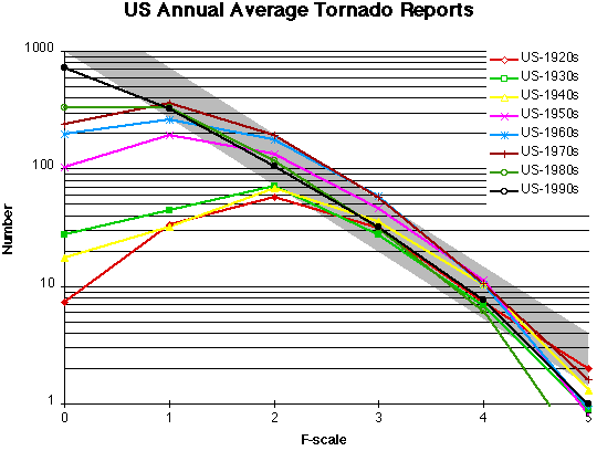
Of particular poignancy at the moment, since as I’m writing this the bodies of third graders are being pulled from a tornado-ravaged elementary school in Oklahoma, is discussion of the relationship between global warming and storminess. Storms are complicated. They vary in number from year to year, they vary in where they strike, and they vary in intensity per storm. Nonetheless there are patterns. There has been exactly one Atlantic hurricane in the south Atlantic ever, as far as we know. They only occur in the north. Tornadoes don’t occur randomly; they are clustered mostly in certain regions of the world and mostly occur during certain months, though there is a lot of variation. (I discuss this at length here and here.)

Hurricanes are fueled by warm seas, and ripped apart by high level winds. Global warming causes sea surfaces to warm, and may also strengthen tropical and subtropical high level winds. So, does global warming mean more hurricanes or fewer? Or fewer but when they happen, stronger ones? Or what?

In the US, severe thunderstorms, bad straight line winds, and swarms of tornadoes typically arise from moist and warm unstable air masses organized along west to east and south to north moving fronts, with the heat and moisture starting out in the Gulf of Mexico, which is a big warm wet place during the summer. It stands to reason that if you heat up the Gulf, you’ll get more of this, and global warming is heating up the Gulf. But the actual distribution and behavior of these fronts will also depend on the distribution of the famous “Jet Streams” and that is potentially altered by climate change. So, will global warming involve more tornadoes, stronger ones, or will they simply occur somewhere else? Or what?

There is one thing we know about storms. They are ultimately manifestations of heat, and more specifically, they result from the uneven redistribution of heat originally from the sun concentrated in tropical regions and moving towards polar regions by currents of water and air. In a heated up world there is more energy to feed storms. It is impossible to imagine a significantly warmed ocean and a significantly warmed atmosphere without significantly more storm activity and/or stronger storms, and maybe even some new kinds of storms. The problem is that it is hard to say what kinds of storms will increase, if there will be more of some kind of storm or more severe instances. For that matter, maybe all storm types will “increase” at one time or another, taking turns being the big storm problem for a few years, and sometimes that increase will be in numbers, sometimes in strength, sometimes manifest as a change in location of the patterned storm activity. That would be a statistical nightmare. It would be a lot of “moreness” of various phenomena but distributed across a range of different manifestations so that counting storms or measuring storms of specific types will show a pattern only after decades. This is why we sometimes look at overall damage to property from meteorological events over time, and there we do see a steady increase. It is also why the insurance companies, who are not stupid about these things, are so worried.

“Global warming appeasers” (people who pretend to understand the science but who are really trying to make climate change sound like it is not a big deal, like Ridley) and denialists alike are taking advantage of the statistical difficulty of measuring changes in patterns of storms to assert that “we can’t link storms, or storminess, to climate change.” But we can. We know there will be a link between a heated up earth and storm patterns, we are just more than a little uncertain as to what kind of change that will ultimately consist of.

Again, there will be no good news about storminess. Just more detailed news, and possibly a more nuanced understanding, which unfortunately will require more nuanced reporting and commentary.

Good luck with that.


Photo Credit: DVIDSHUB via Compfight cc

The Mad, Mad, Mad World of Climatism: Mankind and Climate Change Mania

There is a book called “The Mad, Mad, Mad World of Climatism: Mankind and Climate Change Mania” produced by the Heartland Institute. The Heartland Institute is famous for doing all that work to prove that smoking is not bad for you, and more recently, that climate change is not real or is not important or is not human-caused etc. etc. Heartland is a libertarian “think” tank that receives money form big corporate interests like Tobacco and Petroleum and then uses that money to advance the interests of those corporate entities, regardless of the actual truth of the situation. They also use some of their money to threaten law suits against people like me who object to their activities. (But they do so very ineffectively.)

This is one of those books that contains political propaganda, is printed in large(ish) numbers, then sent around to teachers, academics, policy makers, etc. whether they want a copy or not; it is a sort of high level form of spam. You may remember Bell Curve: Intelligence and Class Structure in American Life (A Free Press Paperbacks Book) or J. Philippe Rushton’s Race, Evolution, and Behavior : A Life History Perspective (2nd Special Abridged Edition), also produced by entities with an anti-social (in this case, racist) agenda, with piles of free copies sent out to a gazillion people. This is the same thing, but for climate change. It is a climate denialist book.

I’m not going to critique The Mad, Mad, Mad World of Climatism: Mankind and Climate Change Mania because my friend and colleague John Abraham has already done a great job of that:

Heartland Institute wastes real scientists’ time – yet again

This spring, I began receiving calls and emails from colleagues about a strange little book that was mailed to environmental science professors around the country. This was a big mailing, in total, a reported 100,000 copies were sent out. What was it about this little book that got us talking? Many things. First….

CLICK HERE to read John’s excellent blog post. You won’t want to miss this. Also, while you are there look at the other posts at John’s new blog, written with Dana Nuccitelli.

Since we are on the subject of books and science denialism, may I recommend that you read, if you’ve not already, Shawn Otto’s excellent book Fool Me Twice: Fighting the Assault on Science in America.


Photo Credit: AZRainman via Compfight cc

Global Warming Consensus: We can haz it!

An important study has just been published1 examining the level of consensus among scientists about climate change.

ResearchBlogging.orgThe issue at hand is this: What is the level of agreement in the scientific community about the reality of climate change and about the human role in climate change? The new paper, Quantifying the consensus on anthropogenic global warming in the scientific literature, address this question and the answer is very clear. The number of climate scientists who question the reality of global warming or the human role in global warming is vanishingly small.

This is not the first study to look at this question, but it is the most thorough effort. This should, however, be the last paper to report this kind of research because, really, we’re there; climate scientists are in very strong agreement about this issue and with this landmark study further demonstration of this fact is superfluous. (John Keegan discusses the merits of this paper relative to other similar efforts and closely examines issues such as sample size and bias here.)

How do we know there a consensus among scientists about human-caused climate change?

The research team, John Cook, Dana Nuccitelli, Sarah Green, Mark Richardson, Barbel Winkler, Rob Painting, Robert Way, Peter Jacobs and Andrew Skuce, examined 11,944 abstracts published in peer reviewed scientific journals from 1991–2011 that covered the topics “Global Climate Change” or “Global Warming.” They coded the abstracts to signify the apparent position on Anthropogenic Global Warming (AGW) and found that 66.4% expressed no position, 32.4% indicated acceptance of AGW, 0.7% rejected AGW and 0.3% expressed uncertainty as to the cause of warming.

Removing those papers that did not express an opinion, 97.1% “endorsed the consensus position that humans are causing global warming.”

The paper also looks at change over time in scientific consensus. The bottom line is that there isn’t much; consensus is not especially new. But there is a small trend, discussed by lead author John Cook in the video I provide below. Also, a look at the “reject AGW” papers shows that there are some patterns. Most are looking at large scale (known) change or cosmic sources of climate change, and they tend to be dated to the earlier part of the time range. Rabbet Run lists them here.

Consensus is often implied and not stated in peer reviewed papers

The researchers then invited the authors to rate the papers they had published. When this was done, the number of papers indicating no position on AGW dropped precipitously to 35.5%. In this rating system, 97.2% of papers endorse the consensus on AGW.

This is important for a couple of reasons. For one, it is an indication that the original coding was conservative, and did not involve assumptions about what the authors may have been thinking. It also shows something about how the scientific process works. If you look at any major scientific concept in the literature, you may find very little explicit endorsement of the overarching theoretical construct or model (like “Natural Selection” or “Germ Theory”) if that concept is fully established. Early writings on a particular major concept often refer to the concept itself and may cite early authors. For example one might see something like “Darwin’s concept of Natural Selection is being increasingly applied to understand the physical features of butterflies” with a reference to The Origin of Species. But after a while scientists stop mentioning the no-longer-novel overarching consensus and stop citing the seminal works. Climate science has moved into this state with respect to the human-caused warming of the earth because of the preponderance of evidence of AGW.

The Climate Change Consensus Gap

Depending on which poll you look at, and when the poll was taken, somewhat more than half of Americans either reject global warming as even being real, reject the human role, or simply don’t know about it. Given the scientific consensus, this is a little like saying that over half of Americans don’t accept Evolution as a valid set of theories and observations, despite the preponderance of evidence for that! (Hey, wait a minute…)

consensus_gap

The point is, the gap between scientific consensus and public opinion is real, and very important. The consensus gap causes bad things to happen. For instance, it is quite reasonable for a government agency to fund or support public service announcements on drunk driving. There is a consensus that drunk driving causes deaths, injuries, and accidents. There is not a consensus gap in that area. But global warming also causes misery and mayhem. Shouldn’t there be public service announcements on saving energy and using alternative sources? The consensus gap means that there can’t be.

This of course has a direct effect on public policy, as noted by Naomi Oreskes writing for Science Magazine:

Policy-makers and the media, particularly in the United States, frequently assert that climate science is highly uncertain. Some have used this as an argument against adopting strong measures to reduce greenhouse gas emissions. For example, while discussing a major U.S. Environmental Protection Agency report on the risks of climate change, then-EPA administrator Christine Whitman argued, “As [the report] went through review, there was less consensus on the science and conclusions on climate change”. Some corporations whose revenues might be adversely affected by controls on carbon dioxide emissions have also alleged major uncertainties in the science (2). Such statements suggest that there might be substantive disagreement in the scientific community about the reality of anthropogenic climate change. This is not the case.

Leadership is when those with influence head directly for the truth, talk about the right thing to do, and help other people to do the right thing. Main Stream Media does not have that … that leadership thing. Main Stream Media does not look at the scientific consensus and then make judgements about what stories to cover and how to cover them on that basis. Rather, Main Stream Media looks at the range of public opinion and treats that as consensus (or lack of) and acts accordingly. Which, in turn, reinforces or even sometimes widens the gap.

This also causes problems in the liminal area of media commentary. Opinion editorials in major outlets like the Wall Street Journal often exploit the Consensus Gap, manufacturing uncertainty or attracting readers from among the misinformed part of the public, and again, reinforcing or even widening the gap and enhancing the level of public misunderstanding or just plain old ignorance. With respect to global warming, it is time for that to stop. As noted by Brendan DeMelle:

It does not get any clearer than this. It should finally put to rest the claims of climate deniers that there is a scientific debate about global warming. Of course, this bunch isn’t known for being reasonable or susceptible to facts. But maybe the mainstream media outlets that have given deniers a megaphone will finally stop.

Global Warming, Big Foot and the Loch Ness Monster

Editorials in Main Stream Media that exploit the consensus gap could be compared to editorials at the New York Times or in the Scientific American or your local newspaper that demand more attention be given to the plight of Big Foot or the Loch Ness Monster. The degree of scientific consensus that those creatures do not exist is about the same as the degree of consensus that AGW is real, though the public “belief” in crypto-critters is less than the public “belief” that AGW is not real. Why? Because Main Stream Media has not taken Big Foot or the Loch Ness Monster seriously in quite some time.

Ten years from now it will be interesting to look back and see how Main Stream Media’s editorial writers who today are sticking with “the jury is still out” on AGW managed their reputations as they looked more and more like they belonged at the National Enquirer rather than a respected news outlet.

John Cook, the study’s lead author, has also blogged about it here and also has a video summarizing the paper, which he discusses some of the earlier research as well:

Dana Nuccitelli, another co-author, blogged about the research here and here.

This work was also covered by The Weather Channel.

____________________
1The embargo ended overnight last night, even though several climate science denialists failed to respect the embargo, thus, seemingly on purpose, violating a pretty standard ethical rule in academia.

The Consensus Project has a web site HERE and the twitter tag is #TCP

This is the paper:
Cook, J., Nuccitelli, D., Green, S., Richardson, M., Winkler, B., Painting, R., Way, R., Jacobs, P., & Skuce, A. (2013). Quantifying the consensus on anthropogenic global warming in the scientific literature Environmental Research Letters, 8 (2) DOI: 10.1088/1748–9326/8/2/024024