Climate Scientist John Abraham and I just finished a session of FtBConscience on Climate Change and during that session we promised to provide some useful links. We also used some graphics during the session. Below are the links and the graphics!
First, here is the video of the session:
Climate Change Science Twitter List
I created a twitter list of people (or organizations) that tweet about current climate change science. If you check this list at any given moment you’ll know the latest climate science news. If you have a suggestion as to who should be added to this list, send me a tweet!
The list is: Climate Change Science
Climate Consensus The 97%
John Abraham and Dana Nucitelli’s blog at the Guardian, mentioned during the session, is HERE. John mentioned his post “Global warming and economists-SuperFreakonomics is SuperFreakingWrong.
A gazillion posts on Climate Change
I’ve written a few hundred posts on Climate Change over they years on this blog, which are HERE.
I have a question about climate change …
If you have a question about climate change, one of the best places to find out a good answer is the web site Skeptical Science. John mentioned this during our session. Pretty much any question you’ll ever hear from anyone about climate change is addressed here, often at multiple levels.
Arctic Sea Ice melt interactive graphics
The really cool interactive graphic we used during the session, showing arctic sea ice melt (surface area) over several years, is HERE. I also talked about this graphic in a blog post HERE.
Other climate change links of interest (please add your favorite non-denialist sites in the comments section below if you like!)
There are a lot of sites, here is just a sampling.
- Climate Progress
- Get Energy Smart
- Paul Douglass’s Weather Blog written by a meteorologist who understand and often addresses climate change (also at Weather Nation)
- Climate Change: The Next Generation selectively aggregates other climate change related blogs.
- Facebook Page with great stuff on it: Global Warming Fact of the Day.
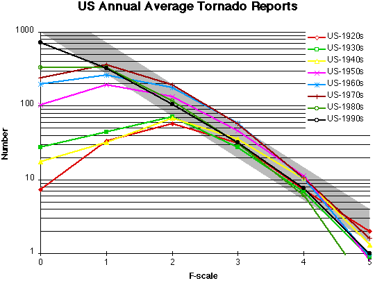
Climate Change Graphics
I have a category for climate change graphics here and Skeptical Science has a page of graphics here. These are both science based graphs and memes (which are also science based as well, of course, but in the form of something you can put on your Facebook Page!) The graphics we used during the session are here:


We also showed the jet stream and orital geometry driven delta–18 cycles but those were randomly drawn from the internet and not vetted so I’m not going to include them. To get a jet stream graphic, just google “jet stream” but also, check out this post on the nature of the jet stream and weather: Why are we having such bad weather? which also has a video with Jennifer Francis, mentioned during our session.
Revision
I want to revise/modify something I said during the session. I referred to the fact that we have yearly data over the last several hundred thousands of years. Most of the data that we use that goes back over long periods of time averages many decades or centuries, or is look at at 1,000 year intervals. Even if we had annual data for every year, we’d probably average it out over centuries of time anyway. What I was referring to, however, is the fact that for many time blocks over this period we have segments of data that can be looked at on a year by year basis, or often, on a quasi seasonal basis with a nearly year-long signal and a smaller winter or spring signal (depending on the data source). This includes lake varves and tree rings as well as other data sources.
I have other questions about global warming!?!!?
If you have other questions, just put them in the comments below.


![drought[1]](https://i0.wp.com/scienceblogs.com/gregladen/files/2013/06/drought1-640x828.jpg?resize=604%2C781)


