The frequency with which shooting events in the US occurs has gone way up in the last few years, according to recent research. Amy Cohen, Deborah Azarael and Mathew Miller have an article at Mother Jones reviewing the research: Rate of Mass Shootings Has Tripled Since 2011, Harvard Research Shows…And: Why claims in the media that mass shootings aren’t increasing are wrong.
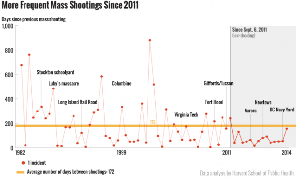
I find the graphic they used a bit odd:
The overall form of the graph shows a decrease over time. But it really shows an increase. You just have to know how to read it. The Y axis is the number of days since the last shooting, which as we can see is very high for several shootings before about 2011, but very low after. But, once you do understand the graph it makes the point very clearly. Notice that there are several time periods prior to 2011 which also have low numbers (meaning more shooting events) but those periods are never very long. There seems to be a dramatic and sustained increase in rate of shootings.
The authors explain it this way:
As the chart above shows, a public mass shooting occurred on average every 172 days since 1982. The orange reference line depicts this average; data points below the orange line indicate shorter intervals between incidents, i.e., mass shootings occurring at a faster pace. Since September 6, 2011, there have been 14 public mass shootings at an average interval of less than 172 days. A run of nine points or more below the orange average line is considered a statistical signal that the underlying process has changed. …The standard interpretation of this chart would be that mass shootings, as of September 2011, are now part of a new, accelerated, process.
